


Summary
The signage within the Christian Education hallway of Hillside Christian Community is not uniform and the staff of the church would like to update and improve the signage. Starting first with meeting with Hillside to learn about their needs. Defining the problem that Hillside’s floor plan caused confusion because it was not easy to navigate. From there I completed user surveys, user walkthroughs, and journey mapping to determine that the signage in the building was not intuitive. From this I compared the signage of other churches and look into ada compliance laws, to determine the optimal placement for signage.
My Role
I was the sole researcher and designer for this project. Completing the process of discovering the problem, defining what to focus on, developing solutions, and delivering a solution.
Evaluation
To gather research information I conducted interviews and walkthroughs of the building, administered surveys, made observations, competitor analysis, sketched designs and constructed prototypes.
User demographics:
Surveys, 25-64 years old, male and female, church attendance 1month to 9 years
Walkthroughs, male 45 years old, female 44 years old, both parents of two boys, both married, members of neighboring church
Research: Walk Through of Building / Meeting with Staff – Took photos of current signage around the church. Talked with staff members about their frustrations with current signage and how they interact with it. Staff expressed what and how they would like to see the signage updated. They expressed that they would like to incorporate digital signage, specifically within the front entrance of the building. Also including the idea of a tree, as with their logo and branching out to the other areas of the church.
Observation: On this Sunday morning, I arrived at Hillside at 9:15am to observe how “users”, church members and visitors interact with the signage within the church, especially the classrooms for children. I was mostly looking for families and parents or adults helping with children as they were the ones who interact most with the signage. Hillside has two front doors, two side doors, and an entryway within the sanctuary to enter for service on sunday morning. Hillside has a team of volunteers and staff members assigned to greet and direct members and visitors as they enter the church. They do an excellent job. So much so that may times signage is completely overlooked because they are being walked through each step by someone who is there to help them.
There was one parent who was new to the church that morning. He was approached and greeted by a volunteer. That volunteer helped the visitor sign in to their KidCheck system (attendance/safety system) and create an account, then they directed them to where they would be taking their children for sunday school that and foreseeable sunday mornings.
One of the struggles of this observation was that I mostly saw users who were members of the church who had prior knowledge of where they were going and how they were to get there. They knew how to navigate the building and didn’t really use the signage.
Survey: Two surveys were created and sent out. One was for staff members of Hillside and one was for members of Hillside. The purpose of both surveys was to determine how the church interacts with the current signage. The staff felt very strongly that the signage needed to be updated, while the church members didn’t seem to have such strong feelings about the signage. The members expressed they understood the signage, but many felt that the overall look could be updated.
Recorded Walk-Thru: Two users were each given the task of finding two rooms within the Christian Education hallway of the church building. Neither users had ever been to Hillside, so they did not have previous knowledge of the building layout or the signage used for the rooms. I had both users were a camcorder on their head to help see where they were looking as they searched for rooms. I asked that they narrate their actions as they moved through the hallway. Both users were able to complete the tasks of finding both rooms. Both users expressed that the wording of the signagage was not consistent. Specifically, several rooms had “3 year olds” listed on their sign. After completing their tasks I asked the users about their thoughts of having door signs that come out from the wall above the door. Both users felt that, that would improve the signage, especially when looking down the hallway and trying to determine the location of a room.
Competitor Analysis: I walked through two other churches in the Pittsburgh area, to see where their signage was placed for their Christian Education rooms. Also, the staff at Hillside provided me with photos of a church in the Atlanta area, that recently had their signage redone, and what they would like to see done for their updates. For the sketches and prototypes, I mostly focused on the photos from the Atlanta church.
Prototype Analysis: From the prototypes we realized that because the staff can’t predict the number of children that will be in each class from year to year there is a need to have the ability to change classrooms around to accommodate different class sizes (different rooms hold different amounts of children). To make this possible, the final prototype has links that the class name can be switch out. After seeing the designs I came up with, two of the prototypes were combined to create the final prototype.
Conclusion and Recommendations
After the observations and survey responses, it was clear that Hillside does an amazing job or greeting and meeting visitors, while re-designing the signage I wanted to make sure that it would enhance the work of the greeters and not make them feel useless. I believe that the reason that most of the church members did not see issues with the signage is because of the greeters. From the interviews, recorded walk-throughs, and competitor analysis, it was determined that the signage should be placed above the door, out from the wall. After some research, it was determined that the signage should hang over the side of the door, where it strikes. The ADA, stipulates that signage be hung on the side where the door strikes, therefore, most people will look for signage on that side of the door because it is where they are used to looking for it.
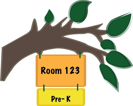
This final prototype of the signage was a combination of two prototypes I created. The staff of Hillside told me during interviews that they wanted a tree or branch theme for the Christian Education hallway, first I sketched out ideas to include the branch theme. Then created two prototypes from two of the sketches the staff liked the best. To ensure that signs could be switched around, due to changing in class sizes, there are two hanging sections from the main branch section that comes out from the wall. The two sections ensure that classroom numbers and age group can be changed as needed.
Due to the unique “U” shape of Hillside’s Christian Education hallway, signage for the classrooms can be confusing, so signs outside of the hillway directing users to different areas of the building, including the Christian Education hallway, should be looked at next, to determine how to best direct visitors throughout the entire building. As discussed during interviews, the staff would like to switch out bulletin boards inside the from doors for large digital screens that scroll through upcoming events in the church.

An aesthetic-driven UX Designer, with a compassionate, empathic approach to problem solving.
Kellyn von Arx © 2022. All rights reserved.